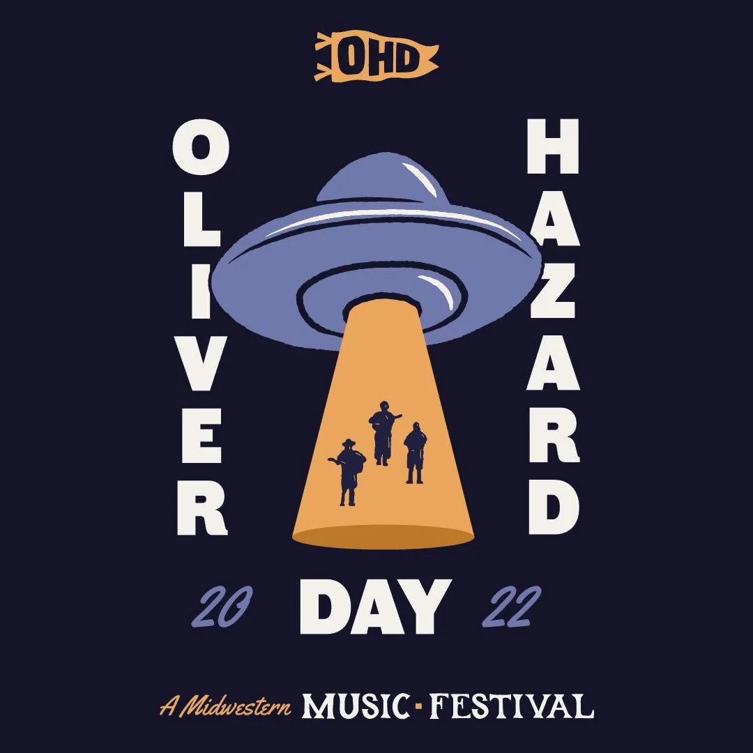
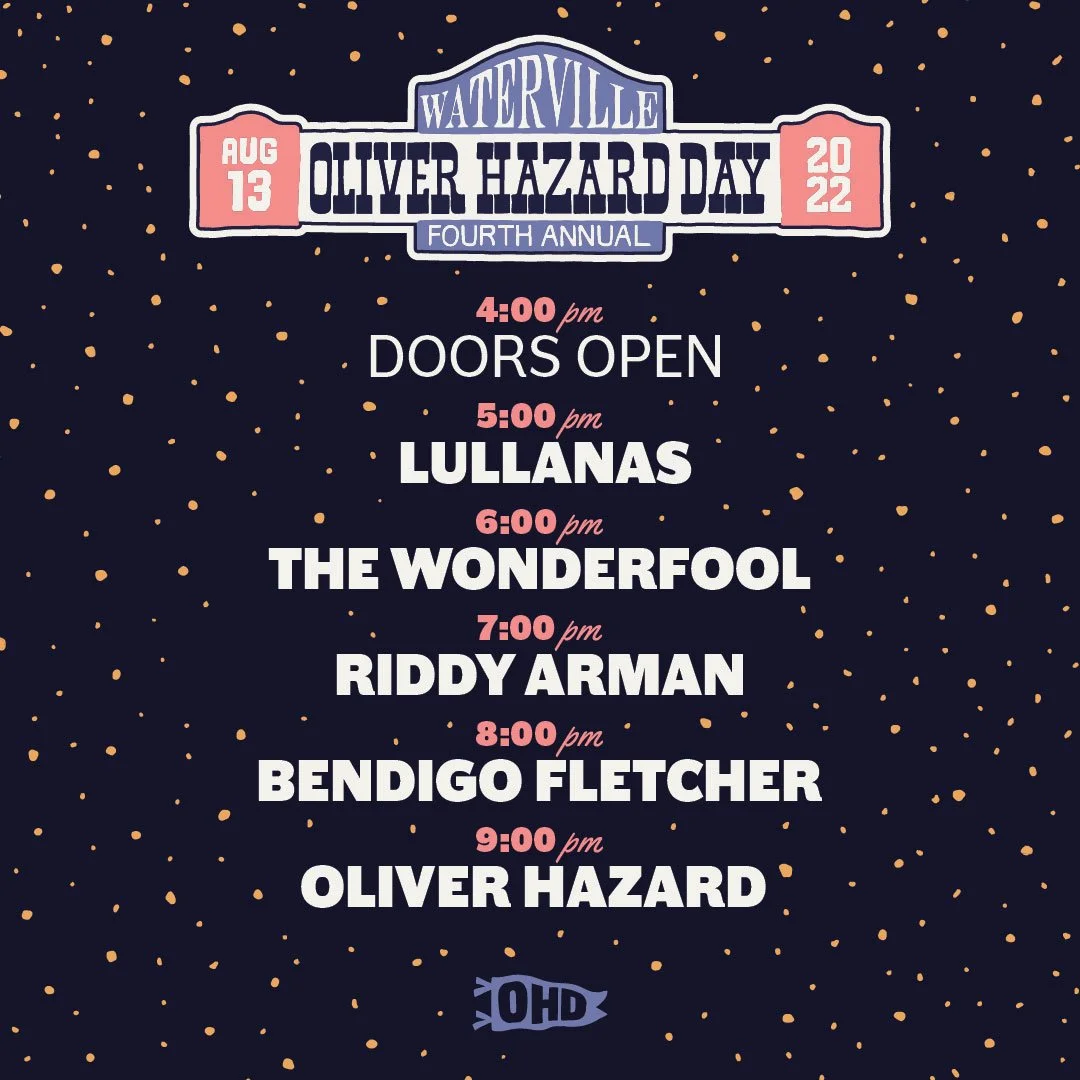
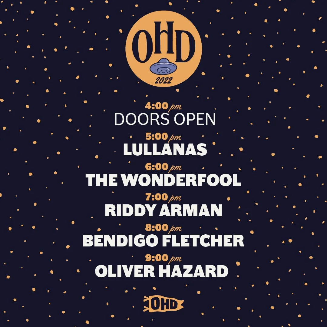
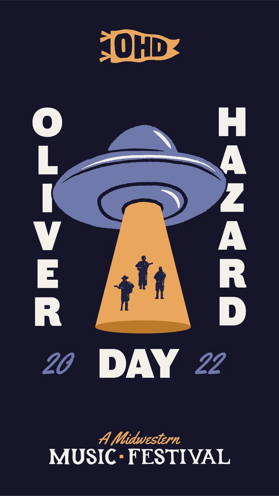
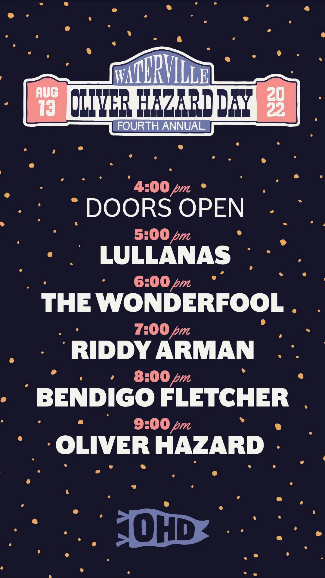
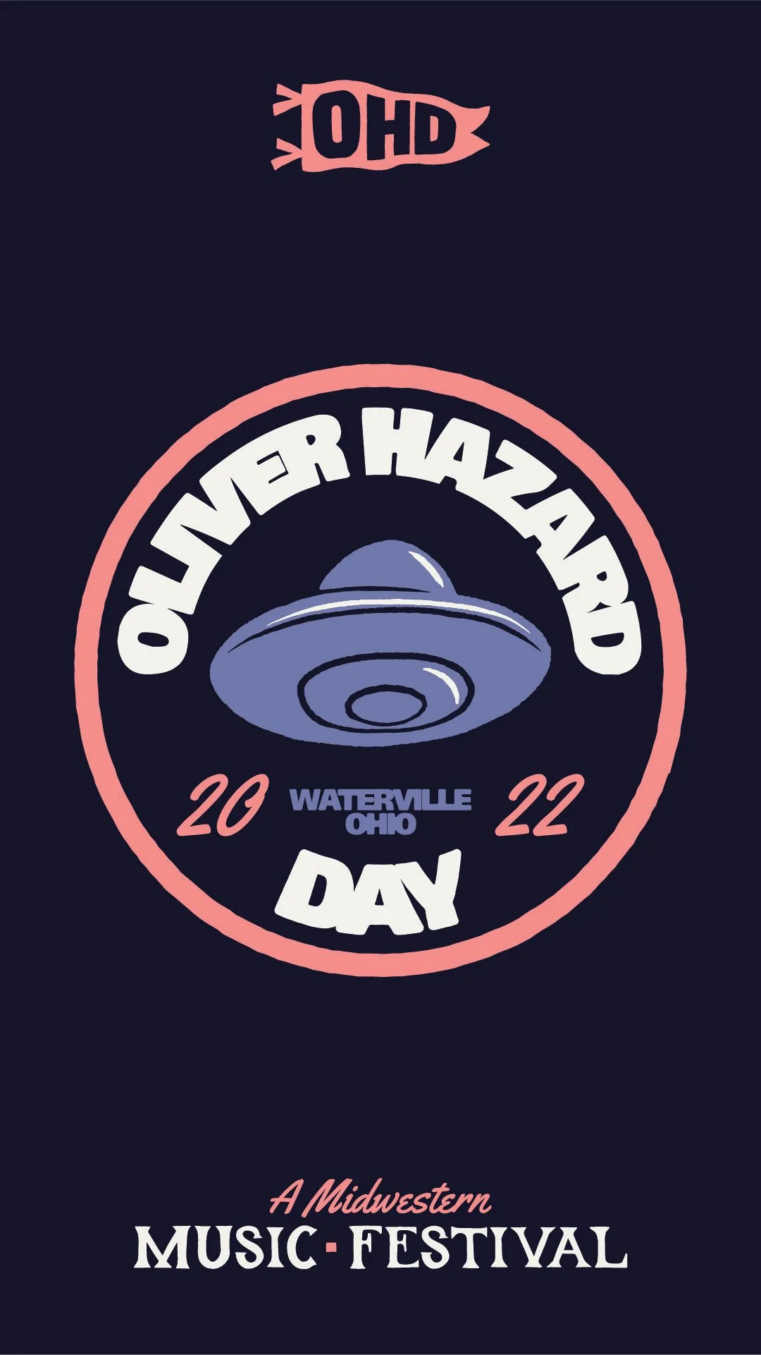
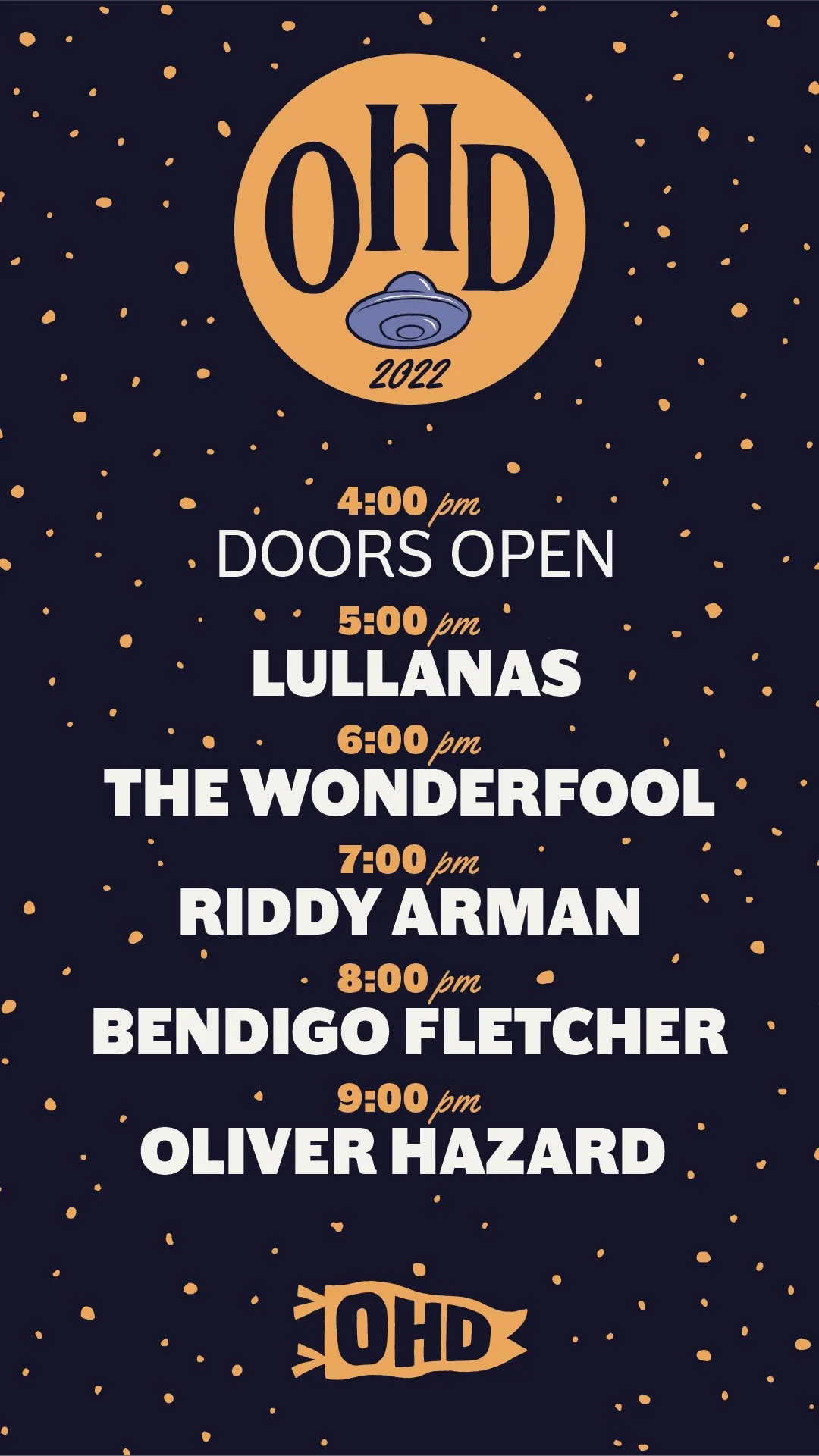
Oliver Hazard Day 2022
Illustration // Apparel // Poster // Logo & Branding
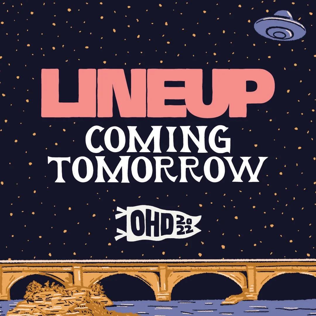
2022
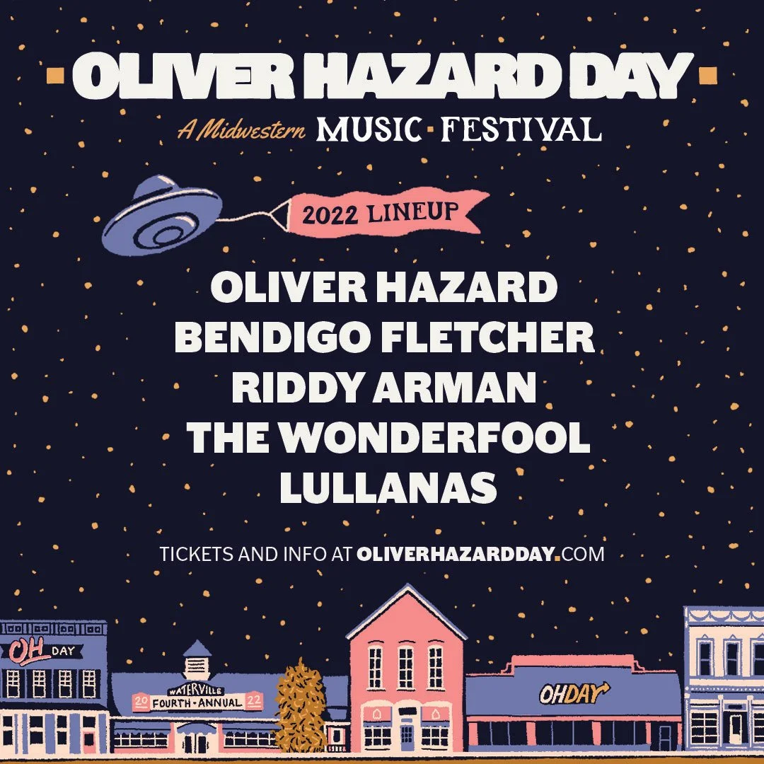
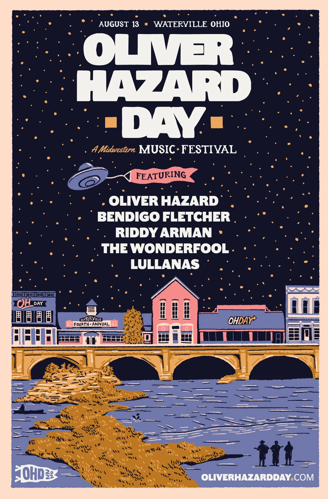
A Midwestern Music Festival.
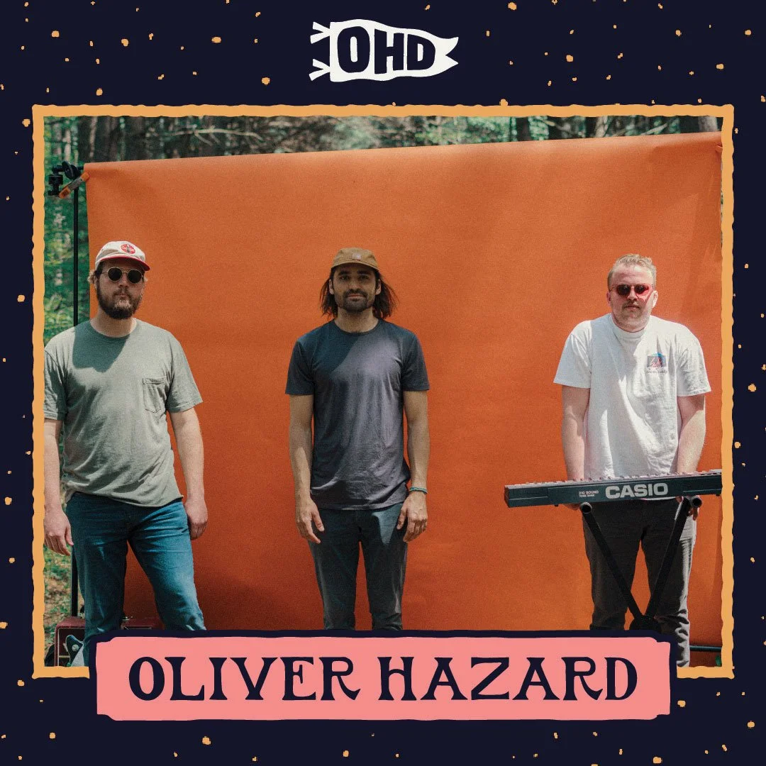
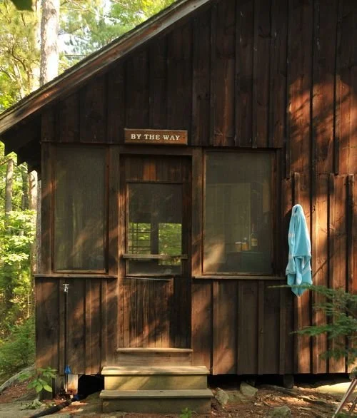
Oliver Hazard holds a music festival every summer in a small town in northwest Ohio called Waterville. They shut down main street, bring in bands from around the nation and put on a great show while supporting great local causes. In 2022, the band reached out to me to set the branding for the event and create the official poster, some merch and other brand touchpoints.

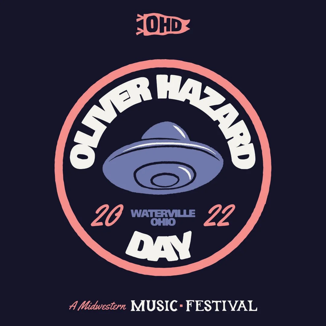
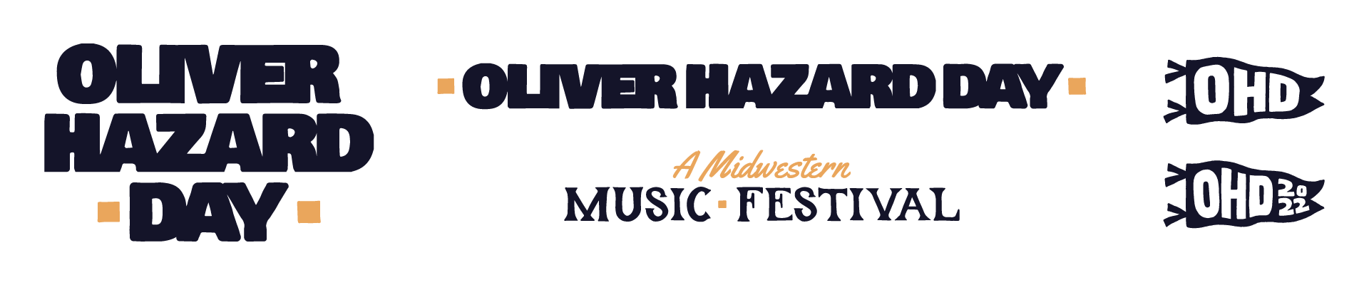
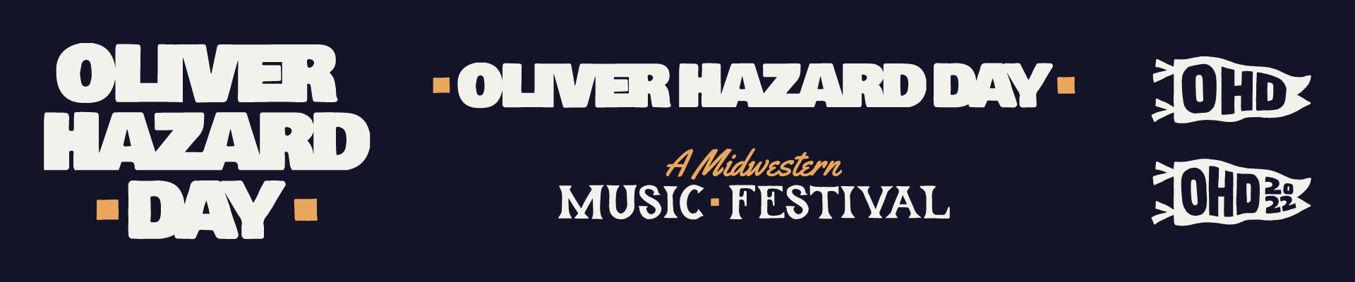
The Brand Marks and Inspiration
When starting the design process, I started looking up a bunch of information about Waterville, Ohio, including history, notable landmarks, architecture, nature, and more. Despite it being just about 10 minutes from the house I grew up in, I didn’t know much about Waterville, so thankfully a ton of Googling from Arizona (as well as some guidance from the band) helped me get where I needed to go.
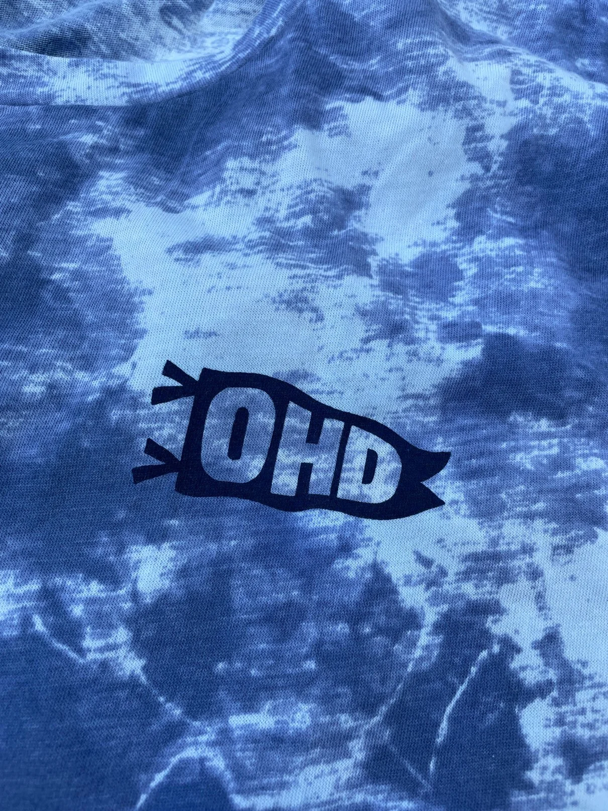
We wanted to keep the logo simple and clean, matching the band’s logo, as well as creating some secondary marks to use when space is scarce or to complement if needed. A Midwestern Music Festival was a fun little tagline that we came up with during the process, and it fits the event so well.
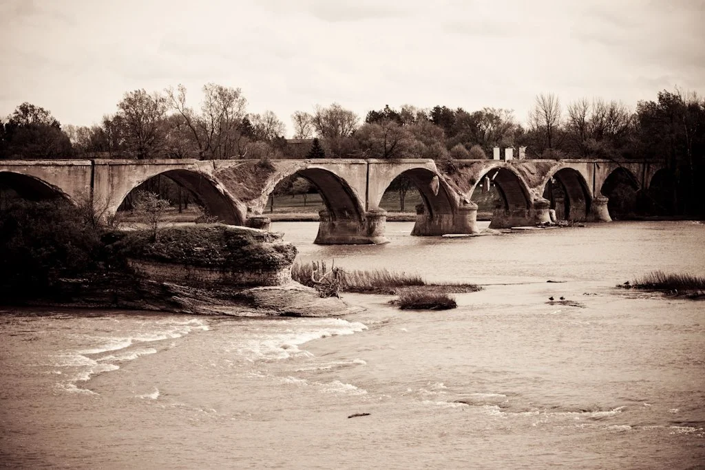
The inspiration for the full design came from the history and architecture of a small northwest Ohio town. It is vintage and historic, with a lot of recognizable buildings directly on main street and the town’s proximity next to the Maumee River.
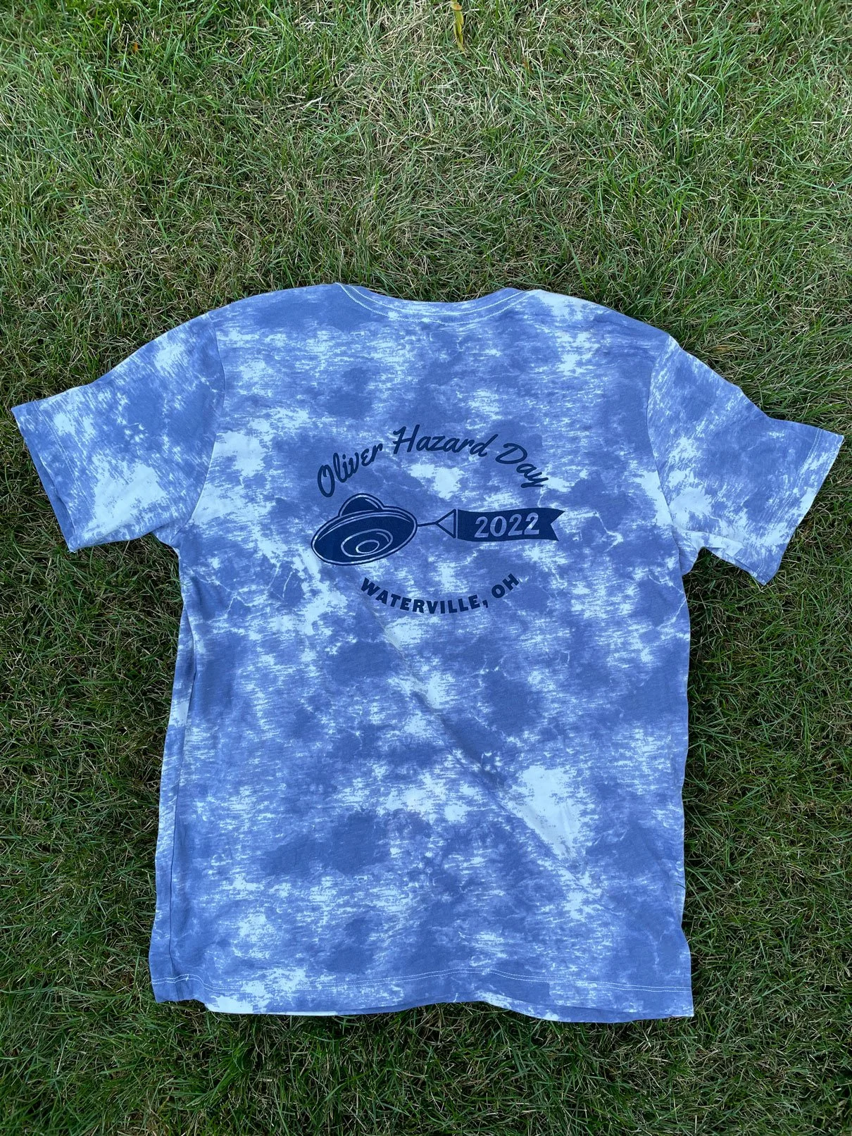
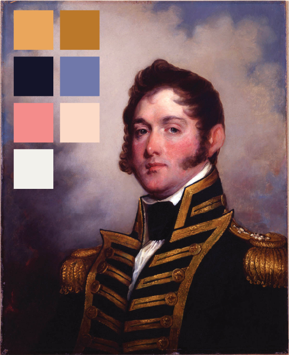
In addition, the band is named after Oliver Hazard Perry, an American naval commander who was known made famous in the area during the War of 1812. We pulled the color palette for the festival from an old painting of him, and then took inspiration from the feel of summer camp and these Midwest United States.
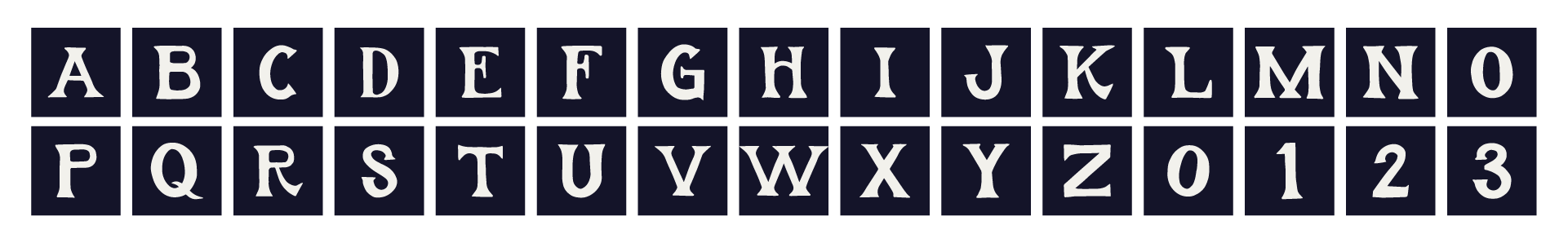
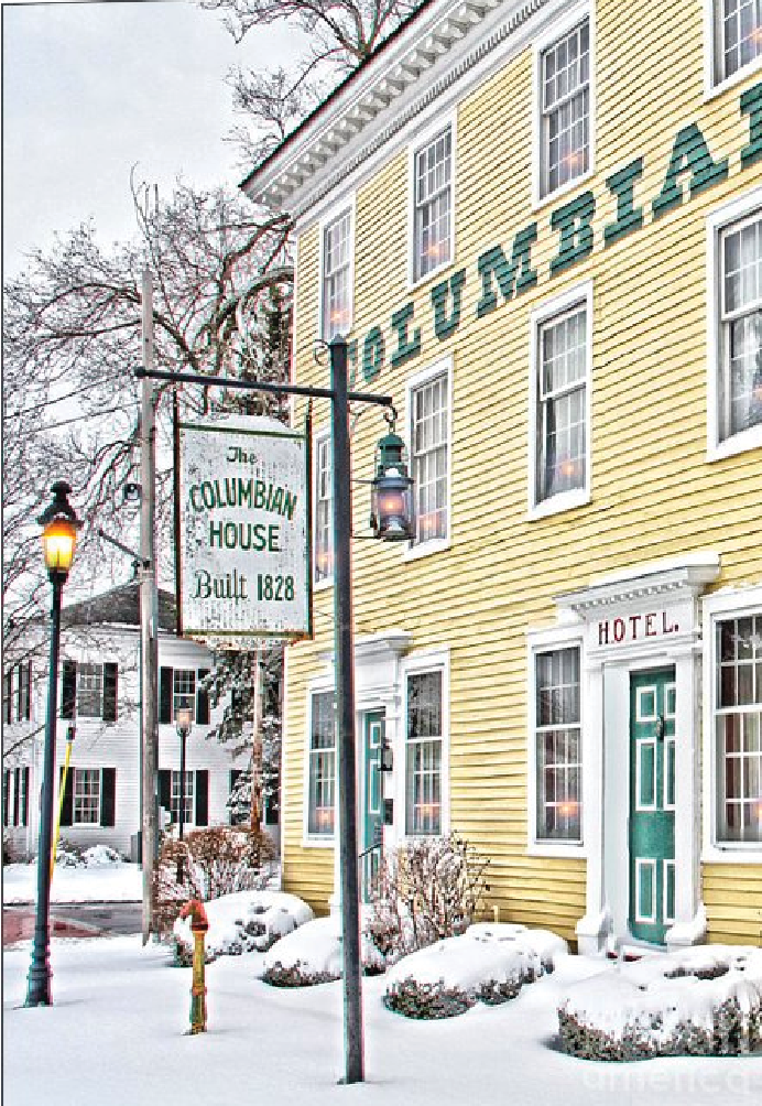
Custom Typeface
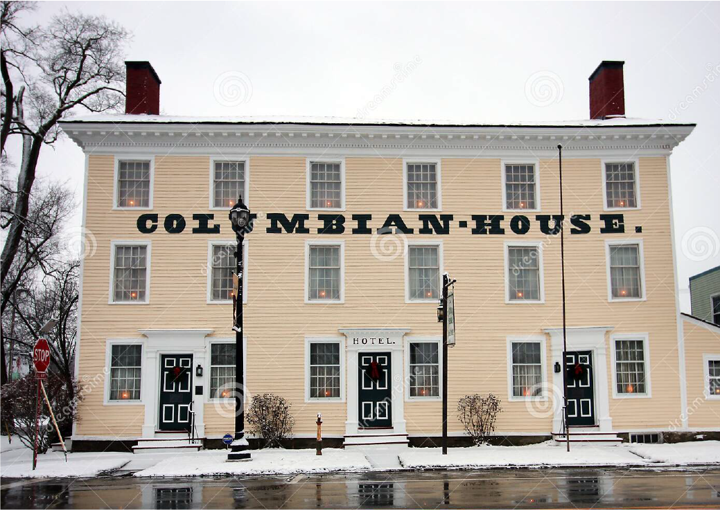
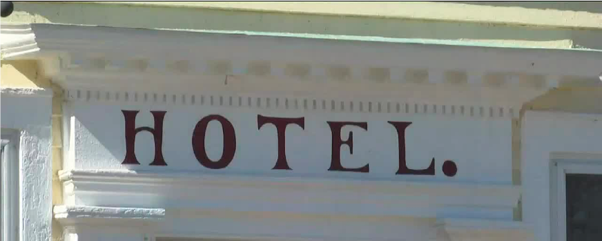
The Columbian House was built in 1828 in Waterville by John Pray, the founder of the town. It began as a stagecoach inn, included a ballroom, housed a jail and was the town’s first post office. Because of the building’s importance, I took inspiration for a typeface I created to complement a bold sans-serif and a script.
The H in hotel on the side of the building really spoke to me and I built out the rest of the alphabet (and a few numbers) from there.
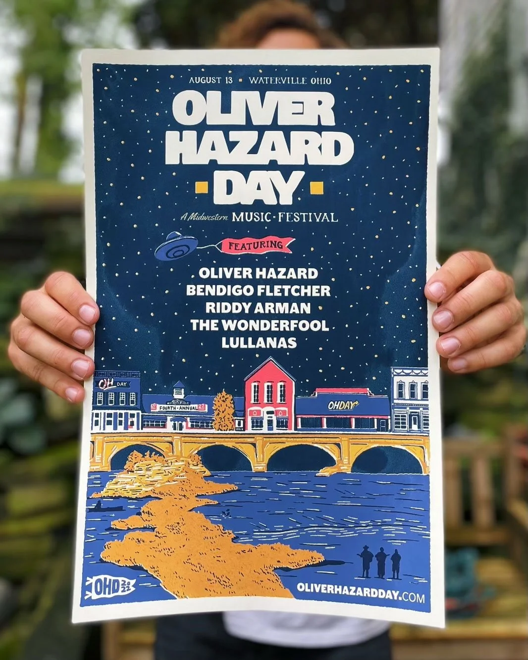
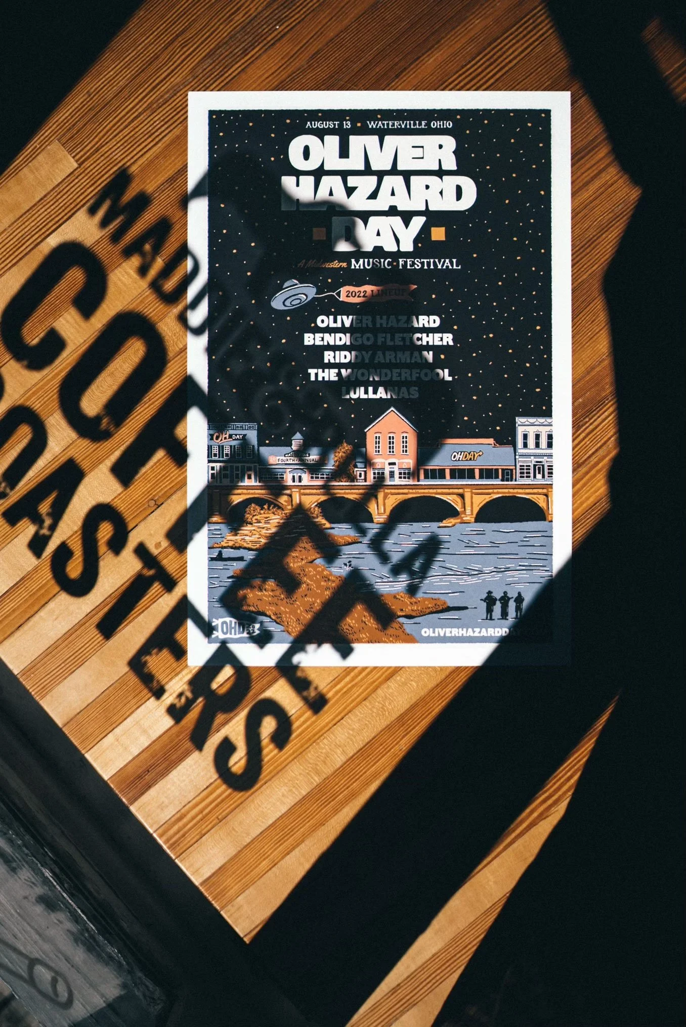
The Poster
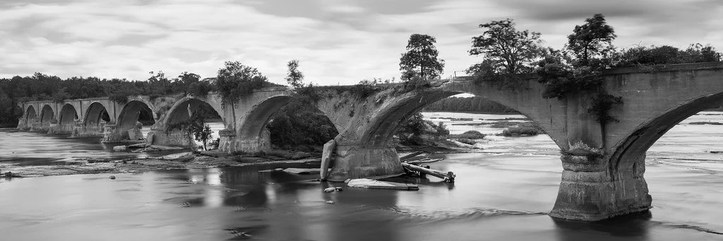
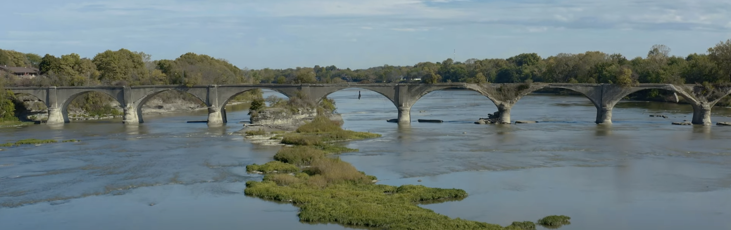
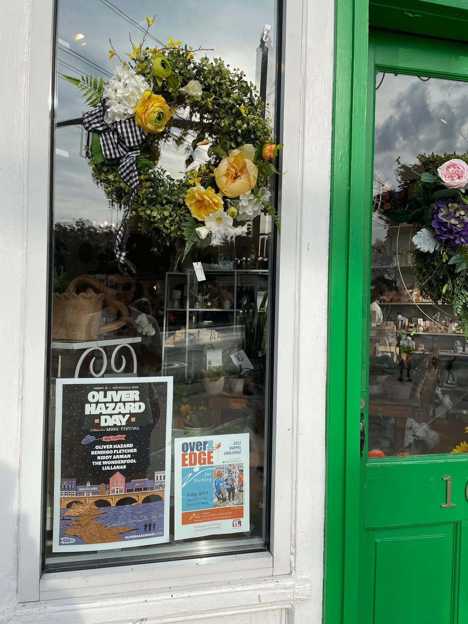
The first big piece was getting the poster nailed down, with all the other applications branching off. I hand drew a small section of the town of Waterville, including the Interurban Bridge which runs across the River, throwing in a few Easter eggs here and there that tie it all back to the band. A local printer called Jupmode printed a limited run of screen printed posters, which came out great and really enhanced the vintage, rough feel I was going for. It was also really cool seeing them in shop windows throughout the Toledo area.
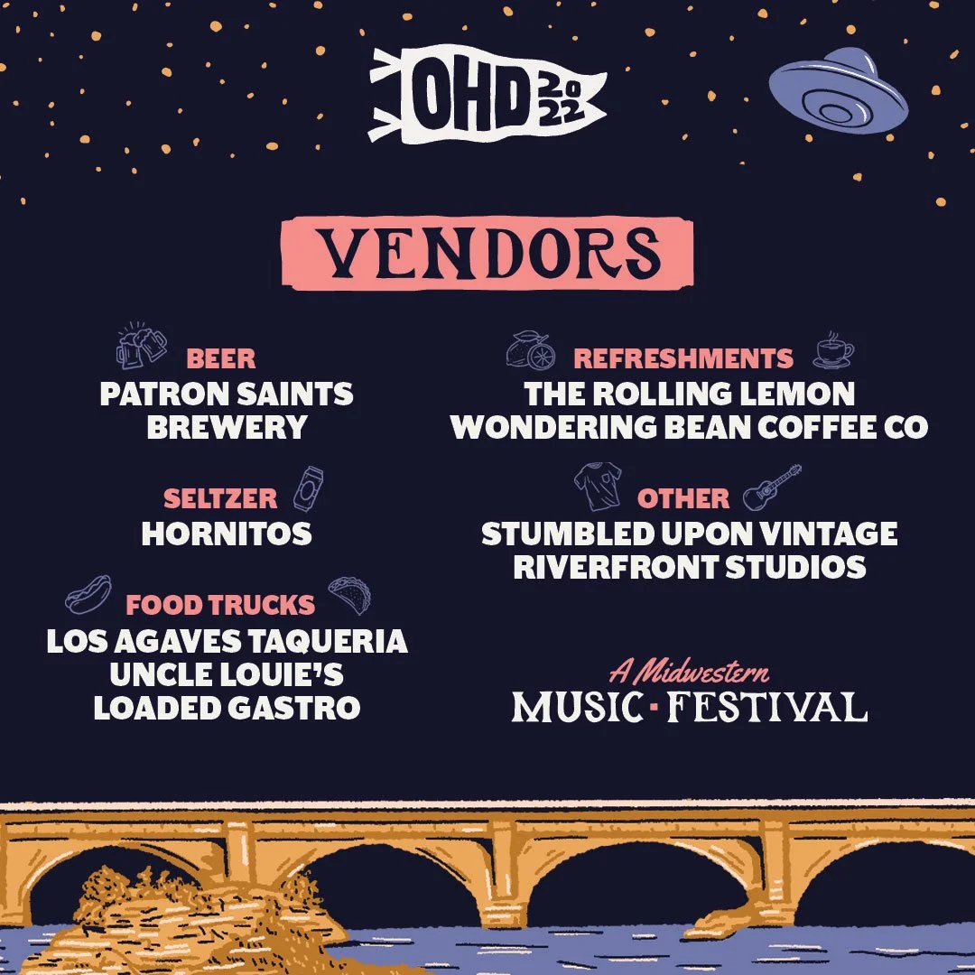
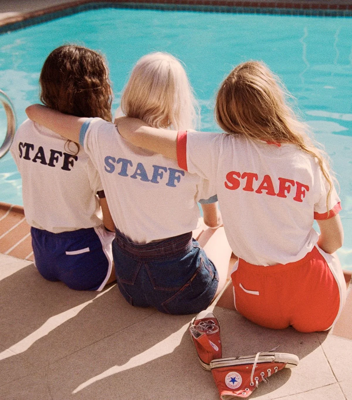
Other Brand Touchpoints
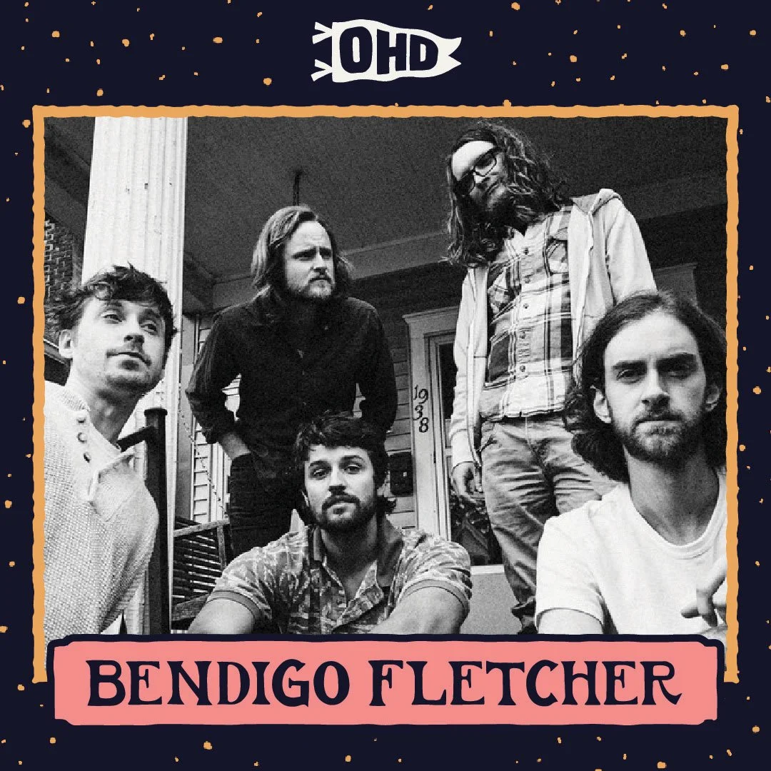
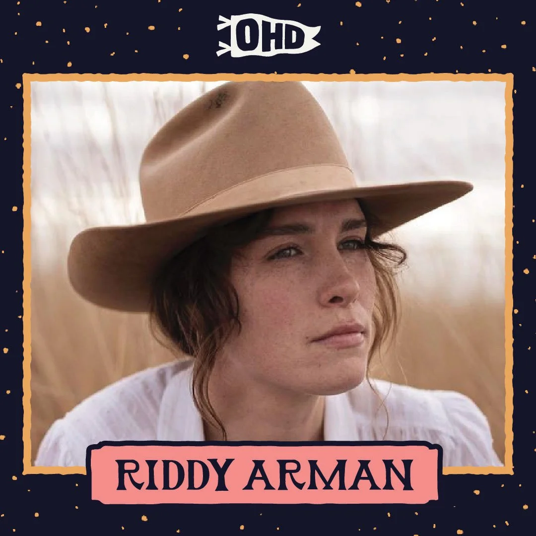
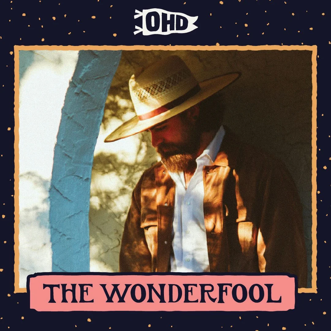
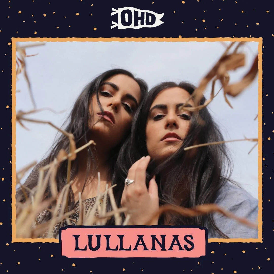
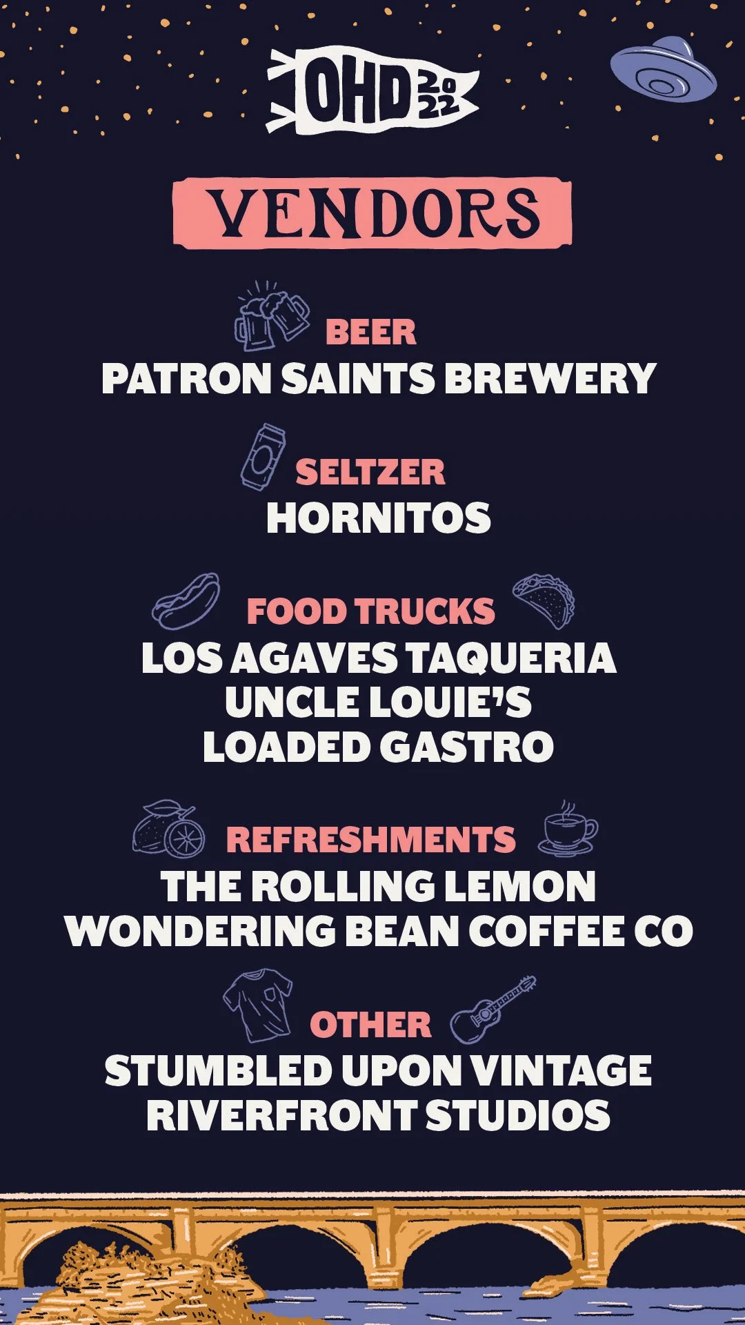
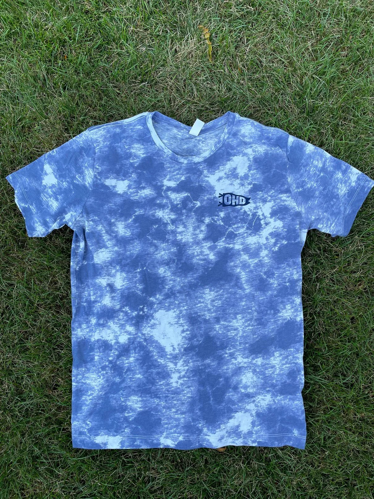
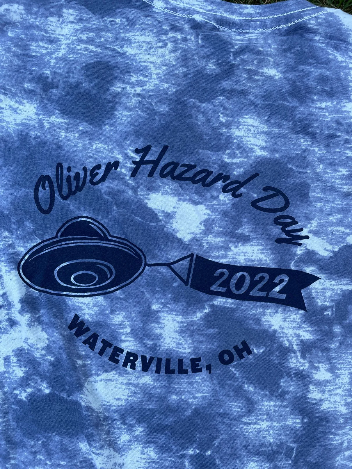
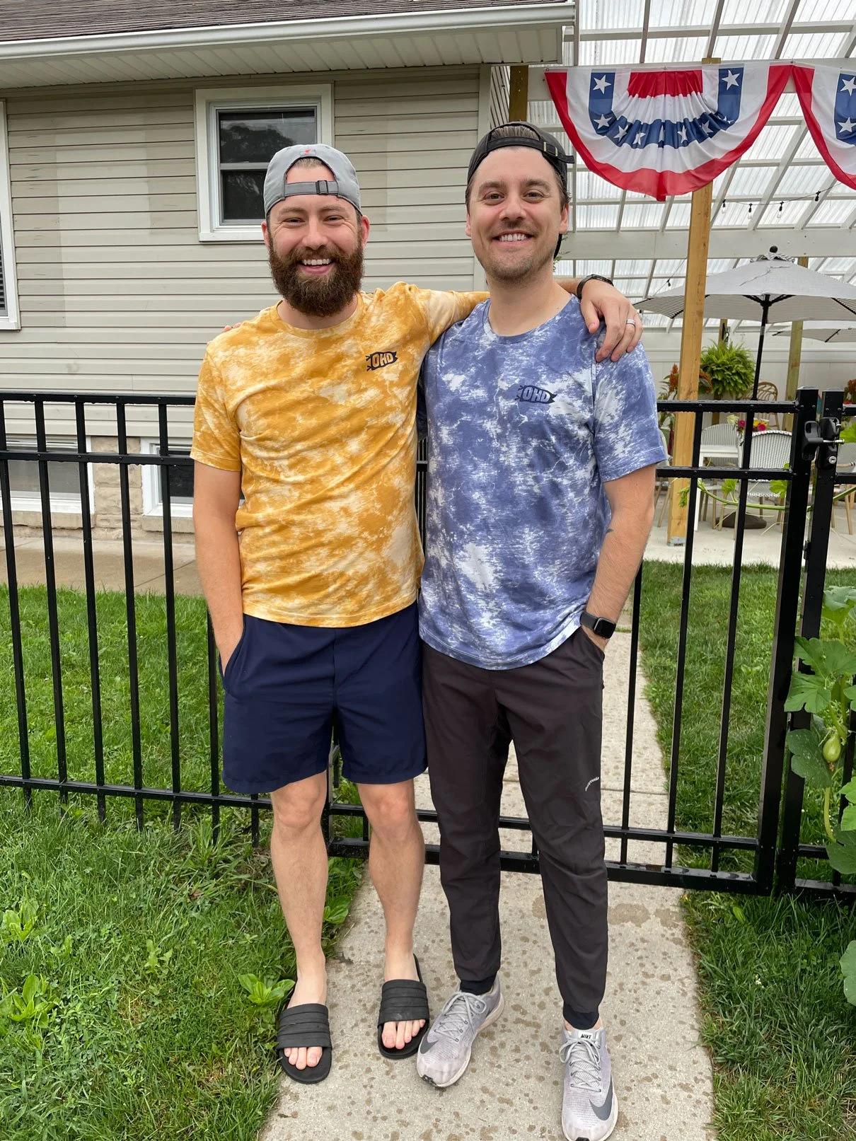
The rest of the stuff fell in place after the poster was finished. I made social and digital graphics, signage for the event, as well as t-shirts, which all tied back to the branding we set at the beginning.